“Ghert Klinghe Made Me”
History of a Medieval Baptismal Font
Jochen Hermann Vennebusch
Lesen Sie hier die deutsche Version dieses Texts.
Jochen Vennebusch
There is hardly any other region like northern Germany when it comes to the number of bronze baptismal fonts from the Middle Ages, with around 113 such fonts (from the Latin fons = baptismal well) having survived in Lower Saxony and Bremen, Hamburg, Schleswig-Holstein, and Mecklenburg-Western Pomerania. While the oldest, such as the baptismal fonts from the cathedral churches in Hildesheim and Osnabrück, date from the early 13th century, the youngest was cast by Master Reimer Jappe in 1515 for the church in Flintbek near Kiel. Spanning about three centuries, the North German firths therefore reflect the whole range of conceptual variations as well as technological facets.
What has often been discussed is the question of why the bronze baptismal fonts of the Middle Ages are concentrated mainly in northern Germany, but not in central and southern Germany. While it was sometimes assumed that this was due to the development of brick architecture in northern Germany as a result of the low naturalstone deposits, it is now assumed that it is due to the fact that bells and baptismal fonts are cast in a similar way. The city of Bremen with the workshop of the Klinghe family dating back to the latter third of the 15th century was an important centre for the production of baptismal fonts and bells, a total of 16 fonts as well as numerous bells still being attributable to this medieval “family business”. Most are signed, which makes definite attribution possible, while others bear conceptual and stylistic details that help us attribute the baptismal fonts to this founding family.
Jochen Vennebusch
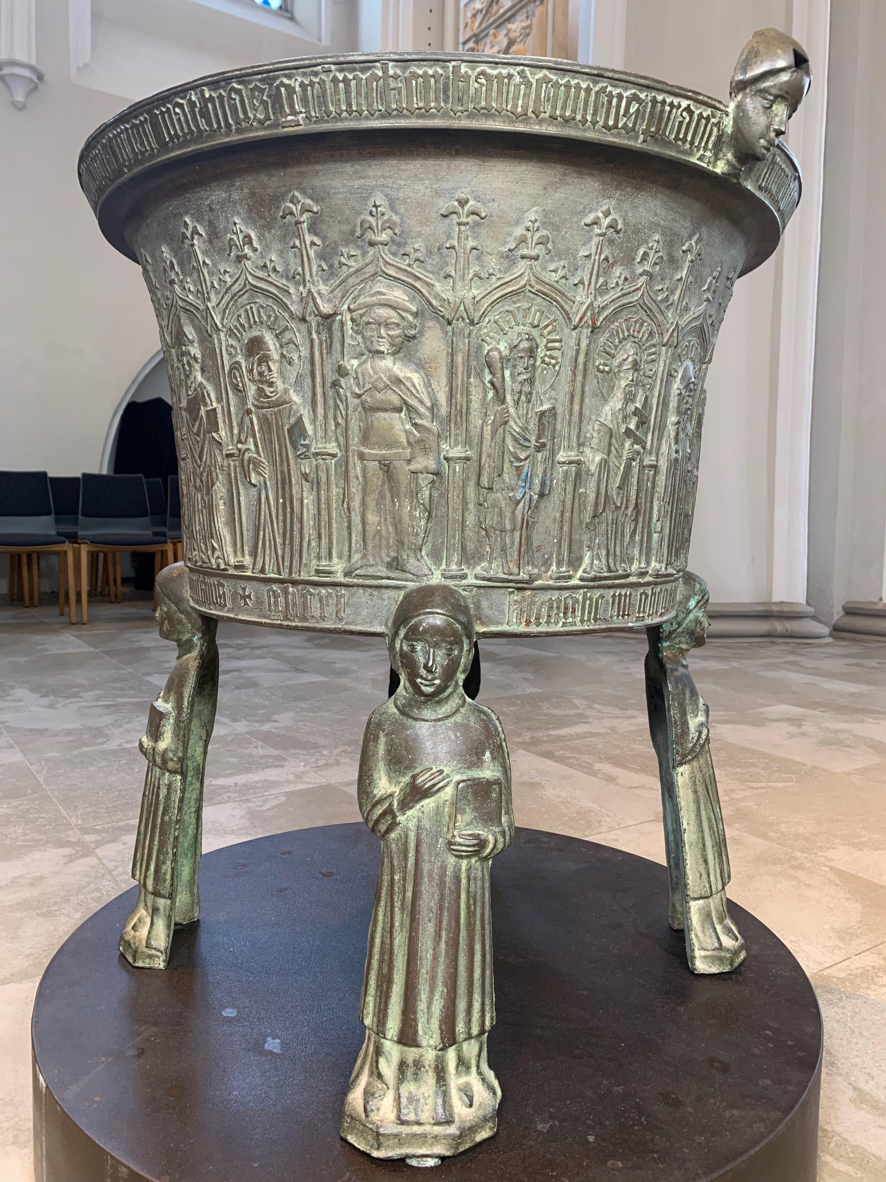
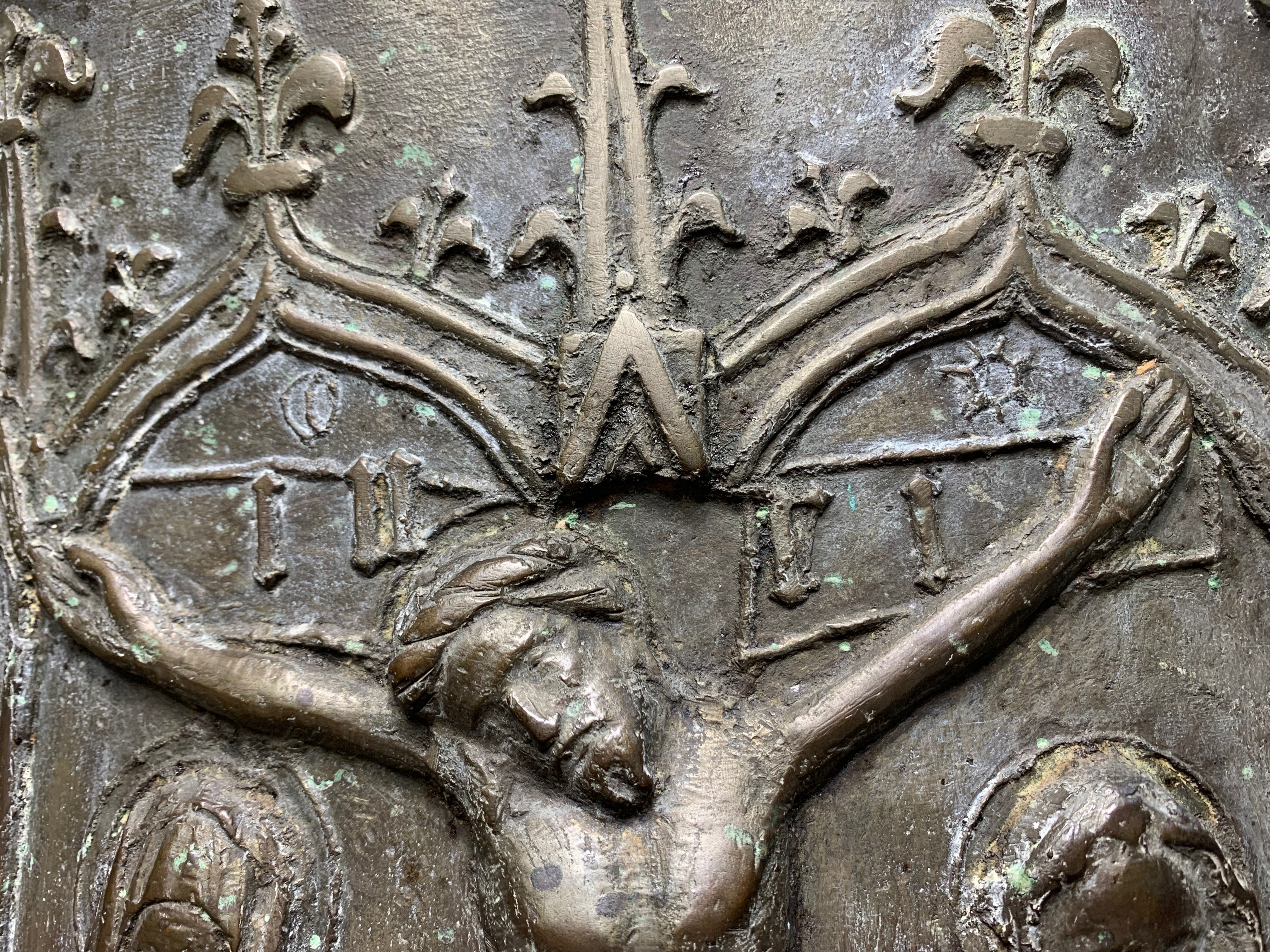
A baptismal font of extremely high quality stands in the former Benedictine abbey of Haseldorf. Measuring 85.6 cm in height, this baptismal font is supported by four figures, each approximately 46 cm high. The dalmatic, the liturgical vestment, identifies them as deacons. The actual baptismal font rests on these figures and is designed like an upturned bell. Circumferential bars divide it into two inscription arches on the upper and lower rims, these enclosing the central register that occupies almost the entire wall and is completely architecturally structured. Beneath the arcades are the figures of saints, designated by inscriptions in their nimbs as “s mathias”, “s bertolome”, “s benedict”, “s iacobvs”, “s simon ivde”, “s iacobvs”, “s andreas”, “s petrvs”, “s pavle”, “s iohans”, “s tomas”, and “s philipvs”. What can also be seen are the Mother of God, Mary with the infant Jesus, a bishop or abbot, possibly St. Maurice, and a depiction of the crucifixion of Jesus. Like the common iconographic scheme that was widespread in the Middle Ages, the crossbeam has below it Mary on the left and the disciple (and evangelist) John on the right. Above the crossbeam are the letters “inri”, which are the first letters of the Latin titulus of the cross “Iesus Nazarenus Rex Iudaeorum”. According to the Gospel of John (John 19:19), this was placed on the cross of Christ by order of Pontius Pilate, and meant “Jesus of Nazareth, King of the Jews” in Latin, but also in Greek and Hebrew.
However, the cross titulus is not the only inscription reproduced on this baptismal font. The inscription on the upper and lower rim, for example, refers to the acquisition and production of the font: “++++ anno + d(omi)ni + m° + ccccliiii venerabilis d(omi)n(u)s abbas iohannes de lv qvi hoc vas fieri ivssit vitvs prior mathias grim(m) eken hardewicvs prang hinricv(s) tornei bertoldvs lvtteken / arnoldvs + dvbbelt + daniel stadis iohannes momckbvsc + ghert klinghe mi ghegote(n) ha(t)” (“In the year of our Lord 1454. The venerable Lord Abbot John of Lu, who had this baptismal vessel made. Prior Vitus, Matthias Grimmeken, Hartwich Prang, Heinrich Tornei, Berthold Lutteken / Arnold Dubbelt, Daniel Stadis, Johannes Mönchbusch. Ghert Klinghe made me.”)
Jochen Vennebusch
The relief of the crucifixion exhibited as a cast illustrates a technological detail to do with how this bronze baptism was produced. It can be seen that the individual letters of the titulus of the cross do not stand on a base line, but are partially reproduced somewhat crookedly. This shows that the baptismal font was made using the mantle-lifting method. A core of bricks standing in a deep pit on a base was first bricked up and then covered with clay. The clay was then scraped off using a template, so that the inner transformation of the baptismal font formed by the core became even. Finally, the so-called “shirt” with exactly the dimensions of the baptismal font that was finally to be poured was applied over a layer of tallow. Again, the clay was accurately turned with a template to give the baptismal font an exact shape and its wall a uniform curvature. Again, tallow was applied, which was also shaped with further stencils to form circumferential ridges that would later enclose the inscriptions. In addition, figures and reliefs were modelled from wax with the help of moulds, and the architectural elements were added. The letters that would eventually form the inscriptions were also attached.
It was important to note, however, that the figures as well as the architecture and inscriptions had to be placed upside down, and the inscriptions even had to be placed to the left. This is due to the fact that baptismal fonts, like bells, were cast with the opening facing downwards and only turned around after casting. After the wax appliqués had been put on, another layer of tallow was applied before the mould was covered with a mantle of clay. Finally, a fire was lit in the base on which the baptismal font was modelled, causing the individual moulds to dry and the wax appliqués to melt on the mantle of clay. Before that, however, they had left their imprint in the mantle. Then the mantle was lifted off, the clay was smashed, and a worker standing on a scaffold finally reworked the mantle from the inside. In this way, small details could be corrected. With the baptismal font in Haseldorf, this concerned the cross beams, which were scratched into the hardened clay with a stylus. Also added afterwards were the small representations of the sun and moon above the cross beam. After this was done, the mantle was put back over the core. The pit was then filled with sand, which was tamped down to hold the mantle in place. Then the so-called feed, the molten bronze, was fed through channels into the mould, where it filled the space between the mantle and the core. After everything had hardened and cooled, the mould could finally be uncovered, the mantle smashed, and the baptismal font lifted off the core. Then it was reworked, polished, and even in rare cases coloured.
As for the baptismal font from Harsefeld, we can now see that some of the letters of the titulus of the cross obviously slipped when the clay for the mantle was applied. We can no longer say today whether they were not applied carefully enough, or whether the clay for the mantle was not attached delicately enough. While perhaps a flaw, these small deviations provide an important insight into how this medieval baptismal font was produced.