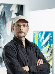
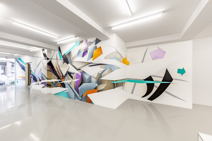
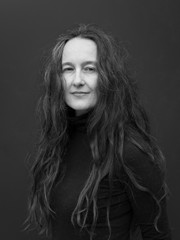
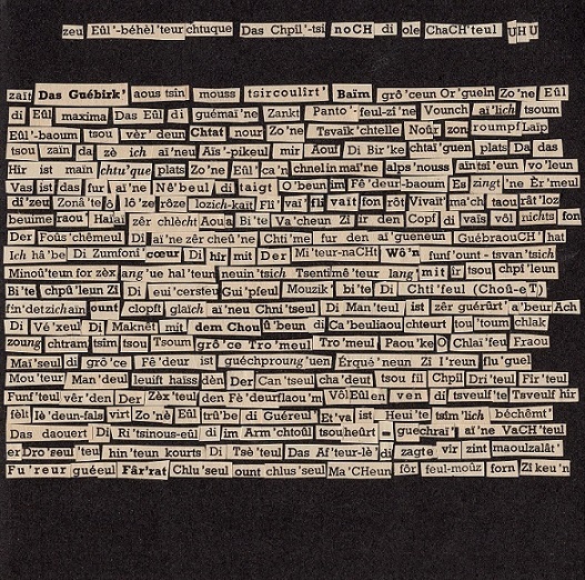
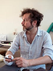
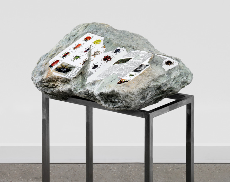
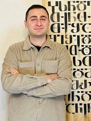
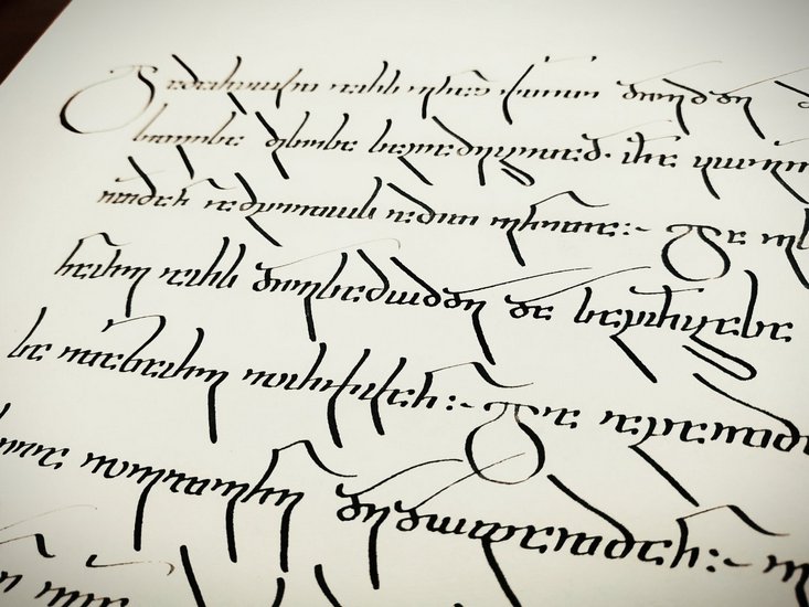
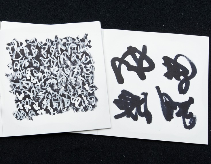
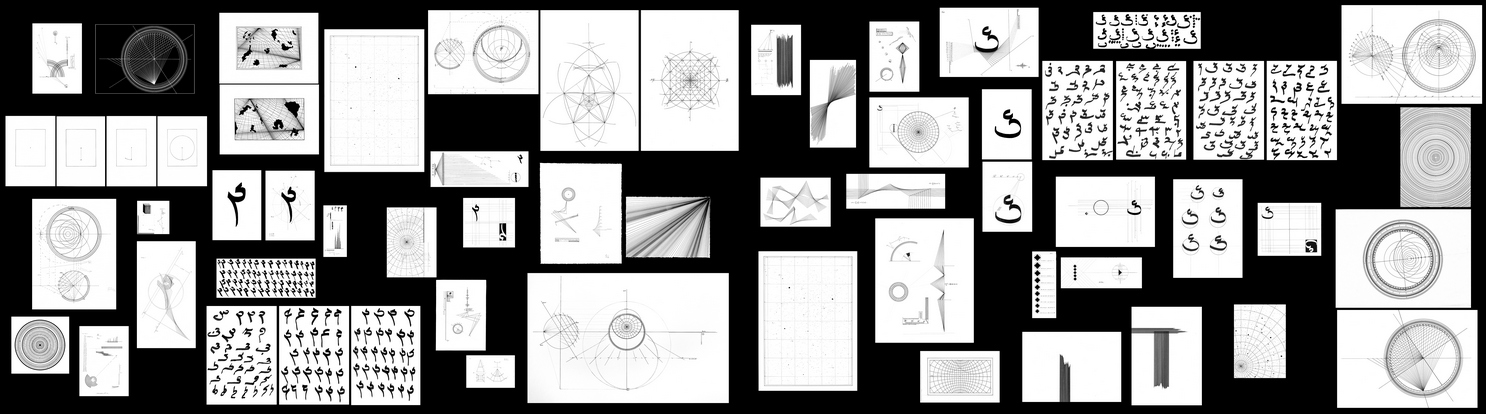
On 12 May, six artists will present their work. What all these artists have in common is that writing plays a vital role in their works. Axel Malik, who is currently Artist in Residence at CSMC, has developed what he calls ‘the scriptal method’, a writing process that yields highly individual sign-like characters that never repeat themselves. Graffiti pioneer Mirko Reisser alias DAIM, also closely connected with the Cluster, has been one of the defining figures of the Hamburg graffiti scene for decades and is internationally renowned for his ‘style writing’. The texts in the works of Philip Loersch are handwritten but are practically indistinguishable from printed texts. Calligrapher David Maisuradze will give a sample of his art with a writing performance. The poet Dagmara Kraus will present her unique ‘cut out poems’. Last but not least, Timo Nasseri, also a former Artist in Residence, will discuss his works which establish a fascinating synthesis of influences from Western and Islamic culture.
Beyond Visualising Language
5 May 2023

Photo: Uta Lauer
From 11-12 May 2023, a CSMC workshop at Deichtorhallen Hamburg revolves around the art of writing and writing as a form of art. Six artists present their works on site and, in conversation with researchers and the audience, explore the relationship between language, writing, meaning, and aesthetics.
‘Beyond Visualising Language’ is an academic conference and art exhibition at the same time – and above all, it is a forum for conversations about the art of writing from both a scientific and an artistic perspective. On 11 May, eight lectures will focus on different writing traditions, for example Hebrew, Persian and Chinese. The keynote lecture will be given by the German philosopher Sybille Krämer.
Academic Contributions
Shervin Farridnejad
Unreadability as an Aesthetic Strategy in Persian Calligraphy
The Nastaʿlīq, which is known as the ‘bride of calligraphy scripts’ and first appeared between the 8th and 14th century, is still the predominant script in Iranian calligraphy. Together with the other calligraphic script taʿlīq, it is largely regarded as ‘The Persian script’ since it thrived primarily in the hands of Iranian calligraphers. However, it was also widely used in Turkey, Afghanistan, and Pakistan. It is still the most popular contemporary style among classical Persian calligraphy scripts. Within the practice of Nastaʿlīq writing, which is the most unambiguous calligraphic script, there is an extraordinary and unique calligraphic practice called Sīyāh-mašq (black practice), which is intended to be intertwined and ‘unreadable’. Beginning in the 7th to 13th century, it seems to be contractual at first glance. This presentation will address the notion of unreadability as an aesthetic strategy in Persian calligraphy with reference to the Sīyāh-mašq and the question of ambiguity in Persian calligraphic art.
Jürgen Fuchsbauer
Autochthonous Development and Foreign Influences in the Two Slavonic Alphabets
The first Slavonic alphabet, Glagolitic, was brought into being in 862 by the Byzantine scholar Constantine the Philosopher, known by his monastic name Cyril, together with his brother Methodius and others. Glagolitic generally reflects Slavonic phonetics. And yet, as Constantine’s conception of sounds and writing was determined by Greek, the alphabet shows a dominant Greek influence, which is, however, concealed in the aesthetic design of the letters. In contrast, Cyrillic represents an adoption of a contemporaneous Byzantine majuscule, which was supplemented by letters for Slavonic sounds based on Glagolitic.
Thus, both Slavonic alphabets are characterised, albeit in different ways, by a combination of Slavonic phonetics and the writing system of Greek. Both take different developments in their history. Cyrillic continued to develop independently but underwent a phase of intensive Greek influence in the 14th century. Glagolitic, on the other hand, was used in Catholic Croatia, where Latin writing traditions had a strong impact on it. In my contribution, I shall give an overview of how the emergence and further development of the two Slavonic alphabets were determined by the striving for an optimal sound-letter-correlation on the one hand and by the models of Greek and Latin on the other.
Andreas Haug
tba
Sybille Krämer
Thinking Writing Differently: Operational Features of Notational Iconicity
For too long, alphabetcentrism and the assumption that writing transcribes spoken language have obscured the view of the creative functions of writings beyond language notation (e.g., numerical scripts, formulaic languages, musical notations, choreographies, binary alphabet, programming languages...). This creative potential is addressed and examined from the perspective of 'notational iconicity' emphasising the connection between visuality, spatiality, and the operativity of graphic notations. Moreover, the anthropotechnical handling of written signs inserts writing into the horizon of a ‘cultural technique of flattening’: Tables, writings, graphs, diagrams, and maps mostly represent invisible issues by means of two-dimensional, spatial, and visual arrangements. The inscribed surface becomes a laboratory, a workshop, and a playing field of communication, computation, cognition, and composition. How can this productivity be explained?
Uta Lauer
Character Building – Meaning Embedded in the Outer Appearance of Chinese Writing
Beyond visualising language, the various types and styles of Chinese writing also carry meaning. The outer appearance of writing may refer, inter alia, to a calligrapher of the past, a social group of writers, a time, or a place. The practise of quoting a particular form of writing was first established in the art of calligraphy, culminating in the 7th century. This evocative way of looking at writing still plays a major role in contemporary China, covering all forms of writing from advertisements to public inscriptions and brand logos.
Annett Martini
Between Halachah and Magic: Writing the Names of God into a Torah Scroll
Since antiquity the copying of a ritually pure Torah scroll is tied into a dense halachic texture of writing rules. The rabbinic concept of a kosher Torah includes not only the writing materials – the skins, the ink, the utensils, which should conform to the Jewish conception of purity and holiness – but also the layout, the correct letter forms, and the special characters. The rabbis determined who was permitted to write, what attributes this scribe should have, and what rituals the act of writing itself was subjected to. This paper will address a particularly sensitive question in scribal literature: the writing of the names of God. Selected sources are presented to illustrate magical, ritual, and religious-legal perspectives on the writing of the holy names into scrolls for liturgical use and to raise the question of the idea behind this extraordinary act of writing.
Christiane Reck
Features of the Calligraphy of the Manichaean Text Fragments of the Turfan Collection
Mani, the founder of the Manichaean religion (3rd century CE), established his religion as a religion of books and arts. He is known as the author a series of books and letters to save his religion from corruption. He is famous also as a painter who illustrated his teachings for better understanding, for example in his famous but lost Book of Pictures. In this way, the composition of the Manichaean books and the style of the script were meaningful from the very beginning. Unfortunately, we have no remnants from this time. But parts of the libraries of Manichaean communities survived at different places. In this presentation, I will concentrate on the Manichaean text fragments from Turfan, mainly housed at the Berlin Turfan collection. These Manichaean text fragments have not been written only in the Manichaean script but also in Sogdian, Uyghur, and Runic script.
What distinguishes calligraphy from ordinary writing? We know several manifestations of the Manichaean and the Sogdian script, on which I will focus here. There are formal and cursive forms. The special calligraphic form is a kind of intentional styling of the letters.
What are other characteristics of calligraphy? Adorned headlines, special signs for interpunction, lines at the margin and between the lines, special forms of letters, especially for initials and headlines. I will present examples of these calligraphic forms and look for the possible reasons for that special design.
Bruno Reudenbach
Art of Writing in Medieval European Manuscripts
In the manuscript culture of the European Latin Middle Ages, phenomena that we can call Art of Writing are not spontaneous, arbitrary, and freely applicable artistic inventions. In the dominant manuscript form, the codex, this art is instead confined to specific locations in the continuum of the pages. There, letters, words, ornamentation, and occasionally images are highly artificially combined and interwoven. Initials and initial pages are the most important example of this. Neither a fixed theory nor any kind of discourse can be proven for this form of writing in the Middle Ages. Nevertheless, a system of its forms and applications can be deduced from the numerous surviving testimonies. The mentioned restriction to certain positions in the codex also means: the Art of Writing is always in correspondence with passages written in simple ‘normal’ script. In the juxtaposition, this not only reveals fundamental differences in the type, size, or colour of the scripts, but also in the legibility of writing or even in the direction of reading. This art is not only a demonstration of artistic skills; it fulfils certain functions in the visual organisation of a codex and can also convey symbolic values and contents by combining characters with other forms.
Artistic Contributions
Mirko Reisser (DAIM)

1989 entstehen die ersten Graffiti-Arbeiten von Mirko Reisser. 1991 beginnt er, als selbstständiger Künstler zu arbeiten und nennt sich fortan DAIM. Sein Programm beinhaltet sowohl die Konstruktion als auch die Dekonstruktion eines Wortes. Seine Graffiti sind Wortformationen, die sich ständig zu verändern scheinen, auf der Flucht sind, sich nicht greifen lassen und damit frei und souverän bleiben. Mit jedem neuen DAIM-Piece nimmt Mirko Reisser die Welt ein Stück mehr in Besitz…
Dagmara Kraus

Dagmara Kraus (*1981 in Wrocław, Polen), lebt als Dichterin und Lyrikübersetzerin zwischen Strasbourg und Hildesheim, wo sie literarisches Schreiben und Literaturwissenschaft unterrichtet. Zuletzt erschienen sind ihr Gedichtband liedvoll, deutschyzno (kookbooks 2021), der Essay Murfla und die Blocksbärte. Die Verwandlungen des Miron Białoszewski (Wunderhorn 2022) und Poetiken des Sprungs (Urs Engeler 2023). 2021 erhielt sie Ehrengabe der Deutschen Schillerstiftung und den Lyrikpreis Meran. Seit 2022 ist sie Mitglied der Berliner Akademie der Künste.
Philip Loersch

Philip Loersch wurde 1980 in Aachen geboren. Seit 2023 entstehen seine Werke in Weßling bei München. In seinen Zeichnungen (die nicht wie Zeichnungen aussehen) will er die Betrachter immer wieder überraschen und verblüffen. So benutzt Loersch seine handgezeichneten Buchstaben als ein Werkzeug, das ihm zur Verfügung – und zur Verführung – bereitsteht.
David Maisuradze

Der Kalligraph David Maisuradze arbeitet mit georgischer Schrift. Er ist Mitbegründer der Georgian Calligraphers Association und hat eine eigene Kalligrafieschule. Kalligrafie ist für ihn eine Interpretation des Textes: Ihre Aufgabe besteht nicht nur darin, die gesprochene Sprache zu visualisieren, sondern auch im Ausdruck des momentanen Gefühls, das der Text erweckt und das der Künstler im Moment der Schöpfung hat.
Axel Malik

1989 beginnt Axel Malik mit seinem bis heute ununterbrochenen Projekt des „Schreibens“, das er die skripturale Methode nennt. Der unlesbare aber nicht unleserliche Schreibprozess besteht aus präzisen, zeichenartigen, sich nicht wiederholenden Setzungen. Großformatige Installationen in Bibliotheken und Schreibperformances sind Schwerpunkte in seinem Werk. Kontinuierlich verfolgt er die Idee, eine Achse zwischen künstlerischen und wissenschaftlichen Impulsen zu knüpfen.
Timo Nasseri

Timo Nasseri wurde 1972 als Sohn einer deutschen Mutter und eines iranischen Vaters in Berlin geboren. Er begann seine künstlerische Laufbahn als Fotograf, bevor er sich Skulpturen, Zeichnungen und Installationen zuwandte. Sein Werk verbindet Einflüsse aus der islamischen und westlichen Kultur. Es ist ebenso von spezifischen Erinnerungen und religiösen Bezügen inspiriert wie von mathematischen und sprachlichen Archetypen und den inneren Wahrheiten von Form und Rhythmus.
The event takes place in two languages: the lectures on the first day will be held in English, the presentations on the second day will be in German.
‘Beyond Visualising Language’ will take place in the Auditorium of Deichtorhallen Hamburg. All lectures are open to the public and free of charge. To participate, please register via our online registration form.