Beyond Visualising Language
A workshop of the Cluster of Excellence 'Understanding Written Artefacts' at Deichtorhallen Hamburg
When: Thursday, 11 May 2023, 11:45 am – Friday, 12 May 2023, 6:15 pm CET
Where: Deichtorhallen Hamburg, Deichtorstraße 1-2, 20095 Hamburg
This event is partly in English and partly in German. Diese Veranstaltung ist zweisprachig.
'Beyond Visualising Language' is a scientific conference and art exhibition at the same time – but above all, it is a forum for conversations about signs and writing.
On 11 May, eight lectures (in English) will shed light on the art of writing and writing as a form of art. By looking at different cultures of writing, they reveal a broad spectrum of shapes that writing can take on.
On 12 May, science and art will engage in dialogue (in German). Six artists will present selected works on site and, in conversation with researchers and the audience, explore the relationship between language and writing, words and signs, legibility and unreadability, functionality and adornment, and form and content.
"Mehr als nur Worte" ist Wissenschaftstagung und Kunstausstellung zugleich – vor allem aber ist es ein Forum für Gespräche über die Schrift und das Schreiben.
Am 11. Mai beleuchten acht wissenschaftliche Vorträge (in englischer Sprache) die Kunst des Schreibens und das Schreiben als Kunstform. Indem sie jeweils verschiedene Schriftkulturen in den Blick nehmen, legen sie ein breites Spektrum dessen offen, was Schriftzeichen sein können: vom Mittel der Sprache bis hin zum ästhetischen Selbstzweck.
Am 12. Mai begegnen sich Wissenschaft und Kunst im Dialog. Sechs Künstlerinnen und Künstler präsentieren ausgewählte Arbeiten vor Ort und nähern sich im Gespräch mit Wissenschaftlerinnen und Wissenschaftlern und dem Publikum Antworten auf die Fragen nach dem Verhältnis zwischen Schrift und Sprache, Wort und Zeichen, Lesbarkeit und Unlesbarkeit, Funktion und Ästhetik, Bedeutung und Erscheinung.
Workshop Organisers: Uta Lauer, Eva Jungbluth, Jakob Hinze

Photo: Karsten Helmholz
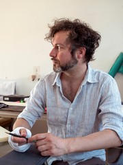
The artist Philip Loersch during his presentation

Photo: Karsten Helmholz
The artist Philip Loersch during his presentation

Photo: Karsten Helmholz
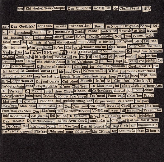
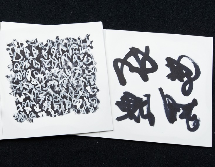
Axel Malik showing some of his unreadable signs

Photo: Karsten Helmholz
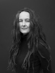
Dagmara Kraus (left) discussing with Axel Malik (middle) and Alexander Weinstock (right)

Photo: Karsten Helmholz
Artist Timo Nasseri in conversation with the scholar Margaret Shortle

Photo: Karsten Helmholz
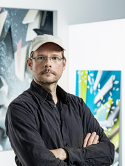
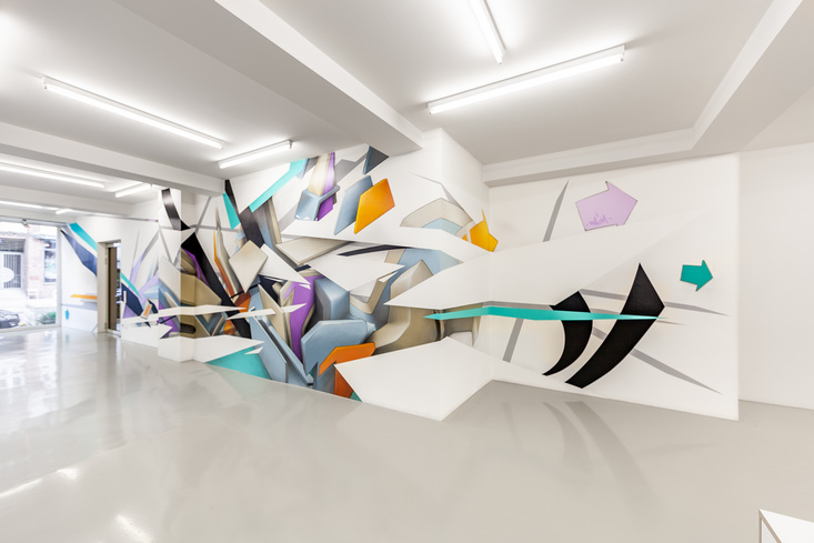
Graffiti Artist Mirko Reisser (DAIM) presenting an image of one of his most recent works on a building in Calgary, Canada

Photo: Karsten Helmholz
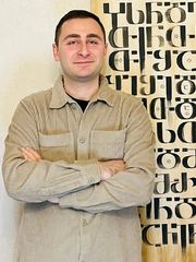
Georgian calligrapher David Maisuradze (left) in conversation with Mariam Kamarauli (right)

Photo: Karsten Helmholz
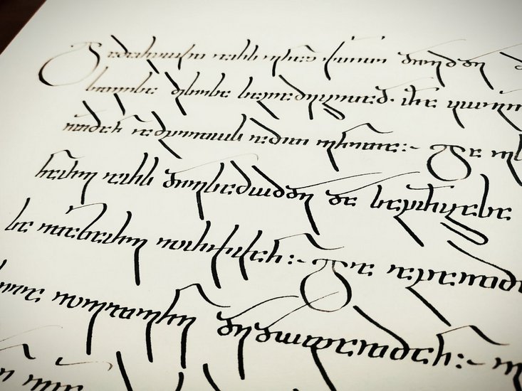
David Maisuradze performing live at the workshop

Photo: Karsten Helmholz
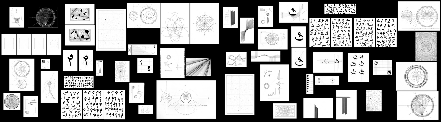
Axel Malik and Shervin Farridnejad during their presentation on Persian calligraphy

Photo: Karsten Helmholz
The academic keynote lecture was delivered by the philosopher Sybille Krämer