No 08
All that glitters is not gold – or is it?
Among the treasures of the Hamburg State and University Library is a manuscript of the treatise De civitate Dei ('On the City of God'), written by the Church Father Augustine between 412 and 426. The volume was produced in c. 1150-70 in the Benedictine Abbey of St. Pantaleon in Cologne. The abbey’s scriptorium is best known for its lavish liturgical manuscripts from Ottonian times (tenth century). The gold grounds of their miniatures served not only to show off their commissioners’ wealth, glistening in the candle-light during the celebration of Mass, the gold also made tangible the presence of the divine. Compared to those earlier manuscripts, the codex containing Augustine’s treatise is relatively plain. Only its title page and two ornamental display pages have been decorated extensively, but they, too, do not contain miniatures, precious pigments, or gold leaf. Have the makers of this manuscript done without the semantic potential not only of images, but also of precious materials? Or have they, as part of a carefully orchestrated introduction to the church father’s treatise, found a way to evoke the symbolic implications of gold and costly dyes without using the actual materials in order to present the work in its proper (i.e. heavenly) light?
The manuscript nearly met with a fate similar to that of the Manuscript of the Month May 2012: in 1704, it had been dismembered and the separate quires, or leaves, together with those of two other medieval manuscripts from the abbey, were offered at the Frankfurt book fair as scrap parchment to be reused by bookbinders. Instead, however, they were bought by the Frankfurt scholar Zacharias Conrad von Uffenbach, much of whose collection today constitutes a significant part of the Hamburg State and University Library’s collection.
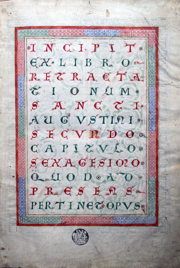
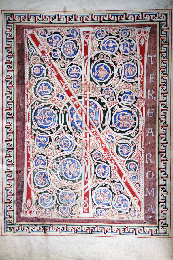
When one opens the book, which has since been rebound, in order to start reading, the first thing that one sees is a title page (fol. 1r, Fig. 1). It is written in a display script in twelve lines, in alternating red and green ink, on the bare parchment, and framed by borders consisting of a simple geometric pattern. It is not, however, the treatise itself that is thus introduced, but an excerpt from another of Augustine’s works, the Retractiones ('re-treatments'). Here, Augustine writes about the De civitate Dei, and this precedes that work as a prologue. Turning the page, on the reverse (verso) of the title page, this prologue opens with a display page. On a purplish-red ground appear intertwined the initials IN, followed by the first words '(IN)terea Roma [Gothorum irruptione … eversa est]'] (Meanwhile Rome has been overthrown by the invasion of the Goths … (fol. 1v, Fig. 2). The prologue then continues on the opposite page (fol. 2r). Augustine had written his treatise in the aftermath of the fall of the Roman empire, which had resulted in a deep crisis of its state religion, Christianity.
Turning another leaf, the treatise proper starts, in which Augustine defends his religion against the conviction of some of his contemporaries who regarded the fall of the Roman Empire as the end of Christianity. With his Civitas Dei, Augustine sets forth a model of a community of believers, a Church founded on theological and historical rather than political and topographical concepts. In the codex, the treatise starts with yet another display page (fol. 2v, Fig. 3) with a large initial and the first words of the De civitate Dei, this time on an ochre ground: '(G)loriosissimam civitatem Dei' ('The most glorious city of God').
The codex from St. Pantaleon is impressive by virtue of its sheer size and volume. Its decoration is of high artistic quality, but the materials and techniques employed are relatively humble. Not only was no gold leaf used, but the initials, formed from exuberant and intricate vine scrolls and framed by borders of illusionistic Greek fret, are not elaborately painted in opaque colours, but drawn in ink and set against simple coloured backgrounds.
It is possible that settling for comparatively humble materials and techniques was a conscious choice. The 12th century was a difficult time for the monastic communities living according to the rule of St. Benedict. It was marked by attempts at reform, among them a return to its followers’ vow of poverty. Some believed that the use of precious materials was a sure sign of worldly decadence; others argued that sparkling gold and gemstones were marks of reverence and symbols of heavenly light and divine presence. Furthermore, although the church fathers’ works were held in very high regard, they did not demand the same degree of reverence as the words of divine revelation written down in the golden Gospel books of the Ottonians.
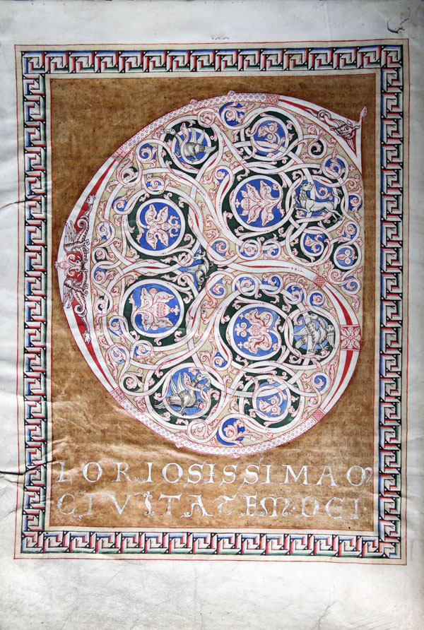
In the Cologne codex, only a few colours are used: red and black, which are also used for most of the pen drawings, as well as green, blue and a light shade of ochre. These colours are also used for the many smaller initials throughout the codex. The only exceptions are the coloured backgrounds of the two display pages. These are not random colour choices: the dark, purplish red against which the initials of the prologue are set (Fig. 2) must have immediately called to a medieval reader’s mind purple, that costly dye which was the prerogative of emperors, kings, and – in images and liturgical objects – Christ. Some scholars have described the ochre ground of the display page at the beginning of the treatise proper as gilded. Looking at it carefully, however, there is no actual trace of gold. Rather, its surface is not matte like the rest of the painted parchment, but smooth and polished, with a waxy sheen, evoking gold not only in the minds of modern scholars but probably also in those of their medieval colleagues. Although purple dye and gold have not actually been used here, by alluding to their colour and texture, their semantic dimensions are nevertheless evoked: emperorship and (heavenly) light. When the reader turns the pages of the codex, the 'purple' page, on which the name of Rome, the ancient imperial capital, is inscribed, is covered with the 'golden' page proclaiming the 'most glorious city of God'. Thus, this carefully orchestrated introduction to the treatise gives visible expression to an idea that is central to Augustine’s De civitate Dei: the old, topographically and politically defined centre of Christianity is symbolically replaced with one based on theological and historical foundations.
References
- Brandis, Tilo (1972): Die Codices in scrinio der Staats- und Universitätsbibliothek Hamburg, Hamburg, 33-34.
- Dickmann, Ines (1998): Blicke in verborgene Schatzkammern: mittelalterliche Handschriften und Miniaturen aus Hamburger Sammlungen; eine Ausstellung im Museum für Kunst und Gewerbe, Hamburg, 26. Juni - 26. Juli 1998, Kat.-Nr. 6, 24-25.
- Legner, Anton (ed.) (1985): Ornamenta Ecclesiae. Kunst und Künstler der Romanik in Köln. Katalog zur Ausstellung des Schütgen-Museums in der Joseph-Haubrich-Kunsthalle, Bd. 2, Köln, 291.
- Schmitz, Wolfgang (1985): 'Die mittelalterliche Bibliotheksgeschichte Kölns', in: Anton Legner (ed.), Ornamenta Ecclesiae. Kunst und Künstler der Romanik in Köln. Katalog zur Ausstellung des Schütgen-Museums in der Joseph-Haubrich-Kunsthalle, Bd. 2, Köln, 137-148.
- Stork, Hans-Walter (2005): 'Handschriften aus dem Kölner Pantaleonskloster in Hamburg. Beobachtungen zu Text und künstlerischer Ausstattung', in: H. Finger (ed.), Mittelalterliche Handschriften der Kölner Dombibliothek (Erstes Symposion der Diözesan- und Dombibliothek Köln zu den Dom-Manuskripten), Köln, 259-285.
Description
Hamburg, Staats- und Universitätsbibliothek
Shelfmark: Cod. in scrin. 5
Provenance: Cologne, c. 1150-70
Material: Parchment, 229 leaves, with modern foliation and numbering of the text columns (two columns per page); three display pages, 21 smaller, ornamental penwork initials on coloured grounds with vegetal and zoomorphic elements at the beginnings of the remaining books; chapter lists preceding each book; in the text, the beginning of each chapter is marked by a red initial and numbered in red Roman letters; marginal annotations from the twelfth century, mostly serving as rubrics or subheadings; some later annotations.
Dimensions: 43 × 32 cm
Text by Hanna Wimmer
© for all images: Staats- und Universitätsbibliothek, Hamburg